Transit Maps
Transit maps have evolved alongside urban transportation systems, serving as essential tools for navigating complex networks of roads, railways, and subways.
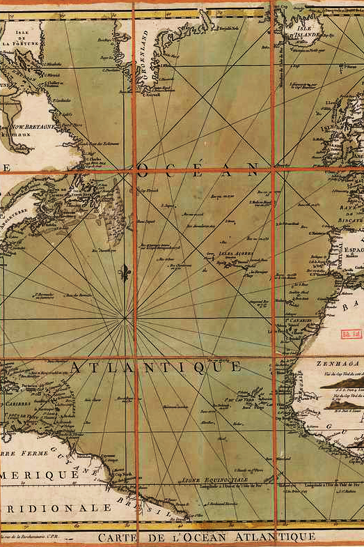
Early transit maps, such as those from the 19th century, were often geographically accurate, but as cities expanded, cartographers and designers developed more stylized, schematic representations to simplify navigation.
One of the most influential designs came in 1933 with Harry Beck’s London Underground map, which replaced geographical accuracy with a circuit-like diagram using straight lines and color-coded routes, a style that influenced transit maps worldwide.
Cities like Tokyo, New York, Paris, and Moscow each developed unique yet similarly schematic designs, balancing clarity with aesthetic appeal. The art of transit mapmaking involves not just technical accuracy but also visual harmony, ensuring that even the most intricate networks remain legible.
Over time, digital and interactive transit maps have further transformed urban navigation, but the core principles of transit map design—simplicity, usability, and aesthetic balance—remain crucial in shaping how millions of people move through cities every day.


